Halloluise
The Luisen-Gymnasium Hamburg-Bergedorf is a pleasant space for learning. It's characterized by the provision of sound education, human interaction and a deep appreciation for others.

Challenge
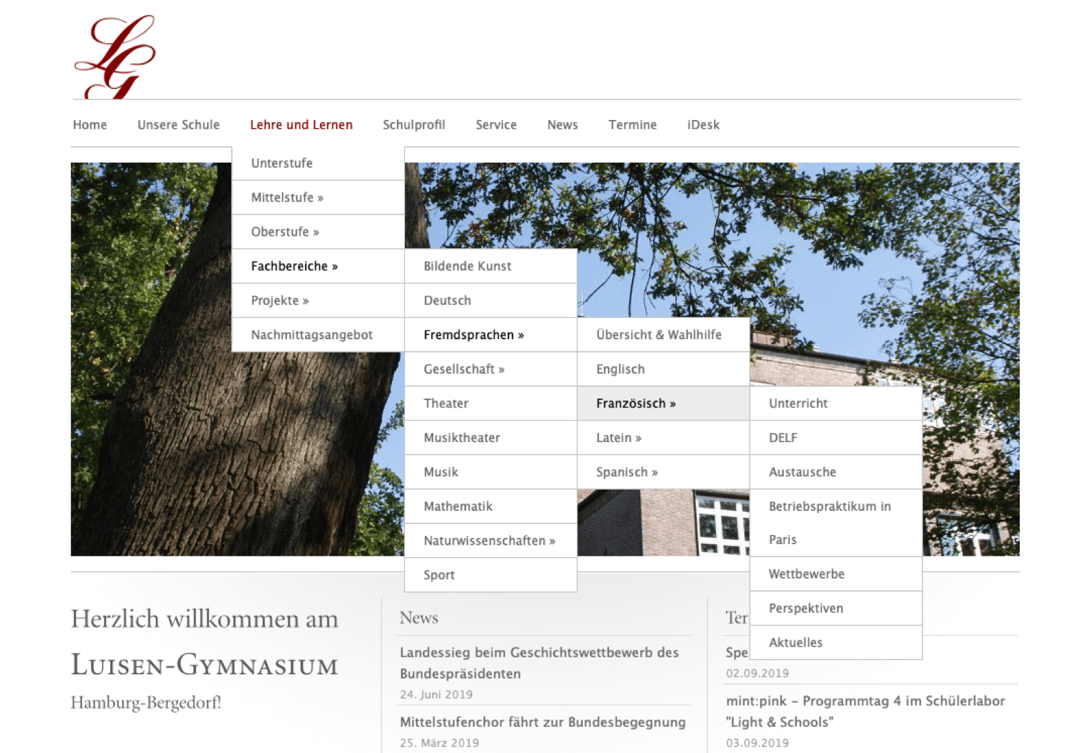
The previous website was neither responsive, nor was there a proper structure for accumulated content. On the other hand, outdated content wasn't removed or updated, resulting in a cluttered page which just grew – instead of scaled.
We ended up having a four-level sub-menu and over 300 pages filled with information. The hardest part was breaking down the existing structure and reducing unwanted dead-ends.
Approach
We started with sorting out all relvant pages and reducing the overall amount of information. This gave us a proper starting point for improving structure and re-creating the navigation.
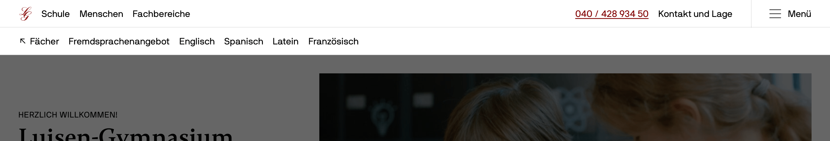
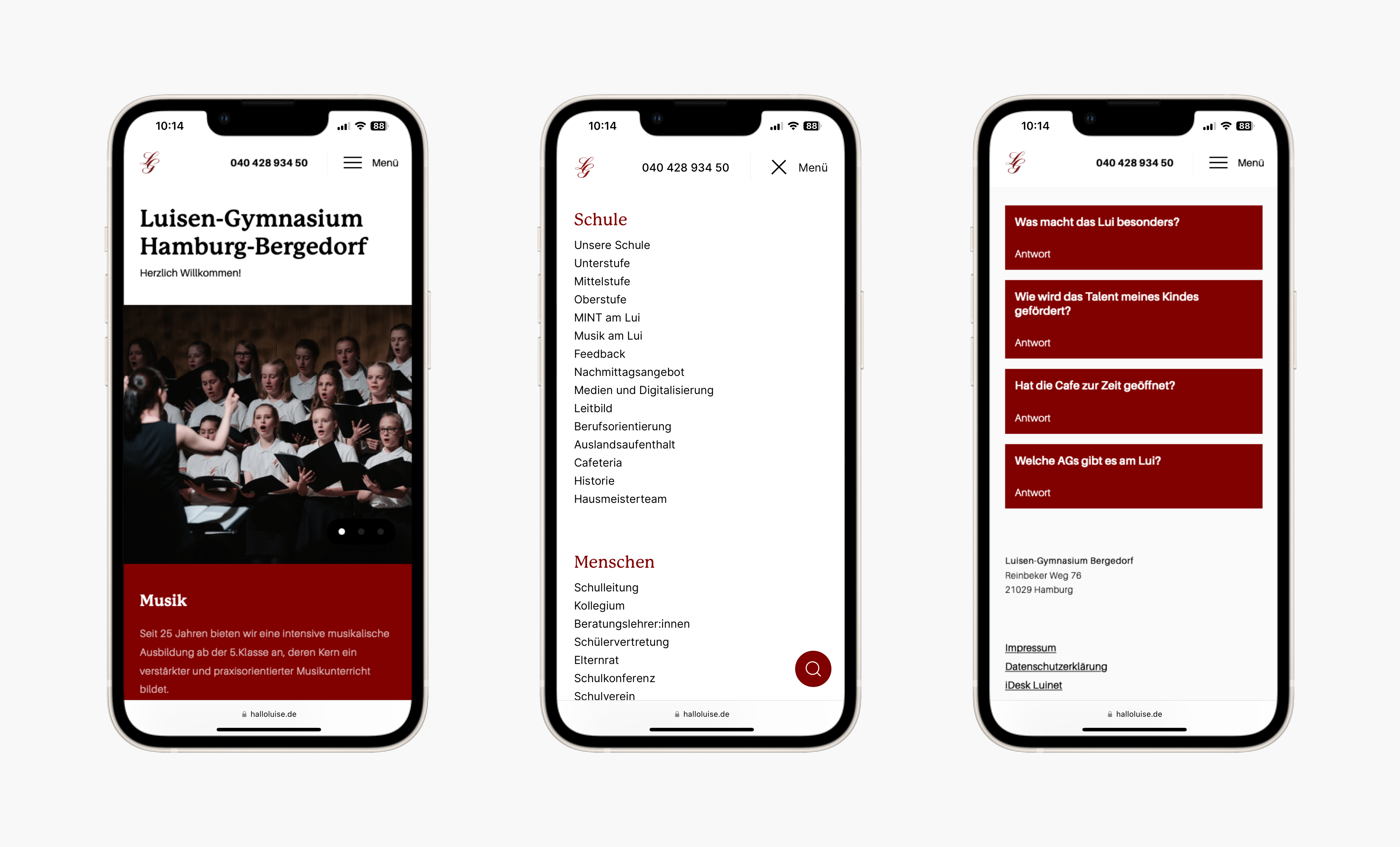
Because there was still a ton of content left, we created a full-screen navigation with critical items with descriptive titles.
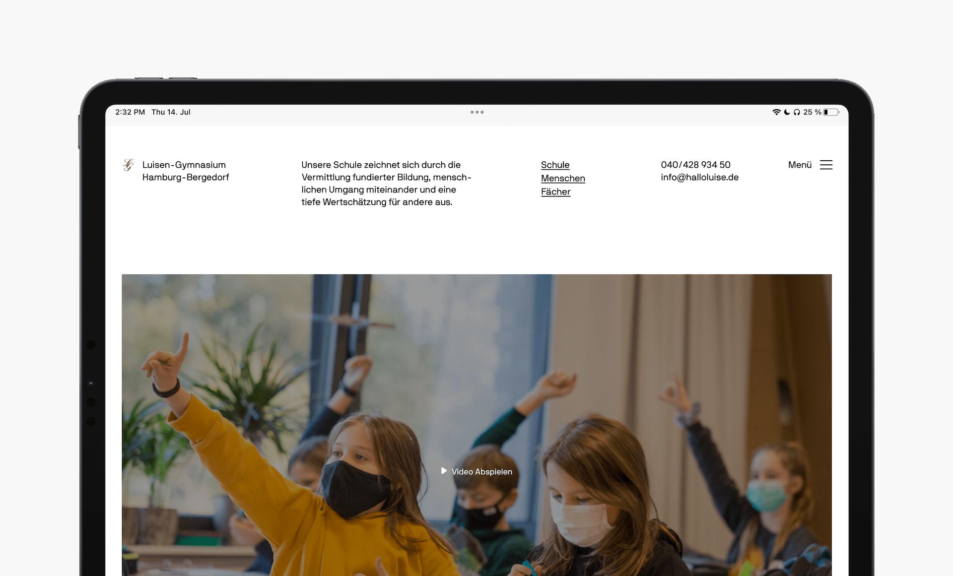
Mobile version
While a school's website may not be primarily used for quickly accessing information on the go, the high volume of traffic and usage demonstrated by the 38,000 unique page views in the first month after launch highlighted the importance of optimizing the mobile experience for convenience. As a result, we focused on ensuring a seamless and effortless mobile experience for our users.
Reducing friction
To show important areas of the school and what the day-to-day life looks like, we placed a slider at the top to highlight crucial aspects.
Right below the introdcution, users can find latest news and upcoming dates at a glance.
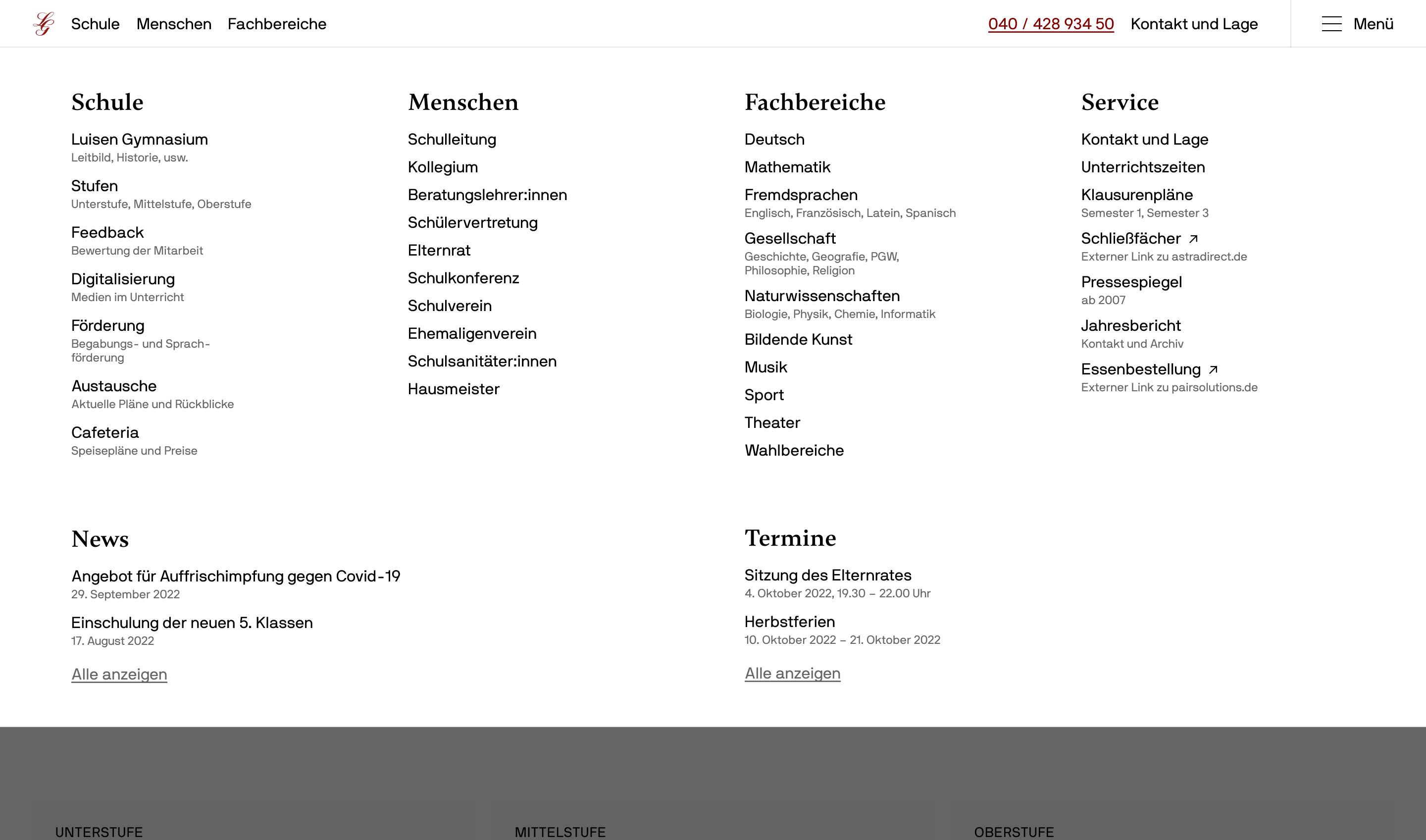
The footer goes beyond legal information, as in showing helpful bits and pieces that can answer a visitor's question straight away. Also, they can find all contact information right at their fingertip. This applies for the school's phone number in the header as well.
Visual language
Building on top of the previous CI, we updated and modernized the appearance and typography. We stuck to the former primary color and lettermark of the logo.
Takeaways
It took immense effort and time to brainstorm and digest the status quo. However, creating a structure upfront helped us identify pain points and critical areas early on.
The old version of the website was hand-coded, which means that every time there was a change needed, only someone who knew how to code was able to handle that. We switched to WordPress to allow easy content editing.
Update: We are preparing to switch to Kirby soon